Hi!
I’ve been a Servoy developer for a pretty long time, since about 2015 but I never really shared anything with the community.
However, since Servoy became responsive I have been fiddling around with it trying to wrap my head around making things work as I wanted to and was having the hardest time at first.
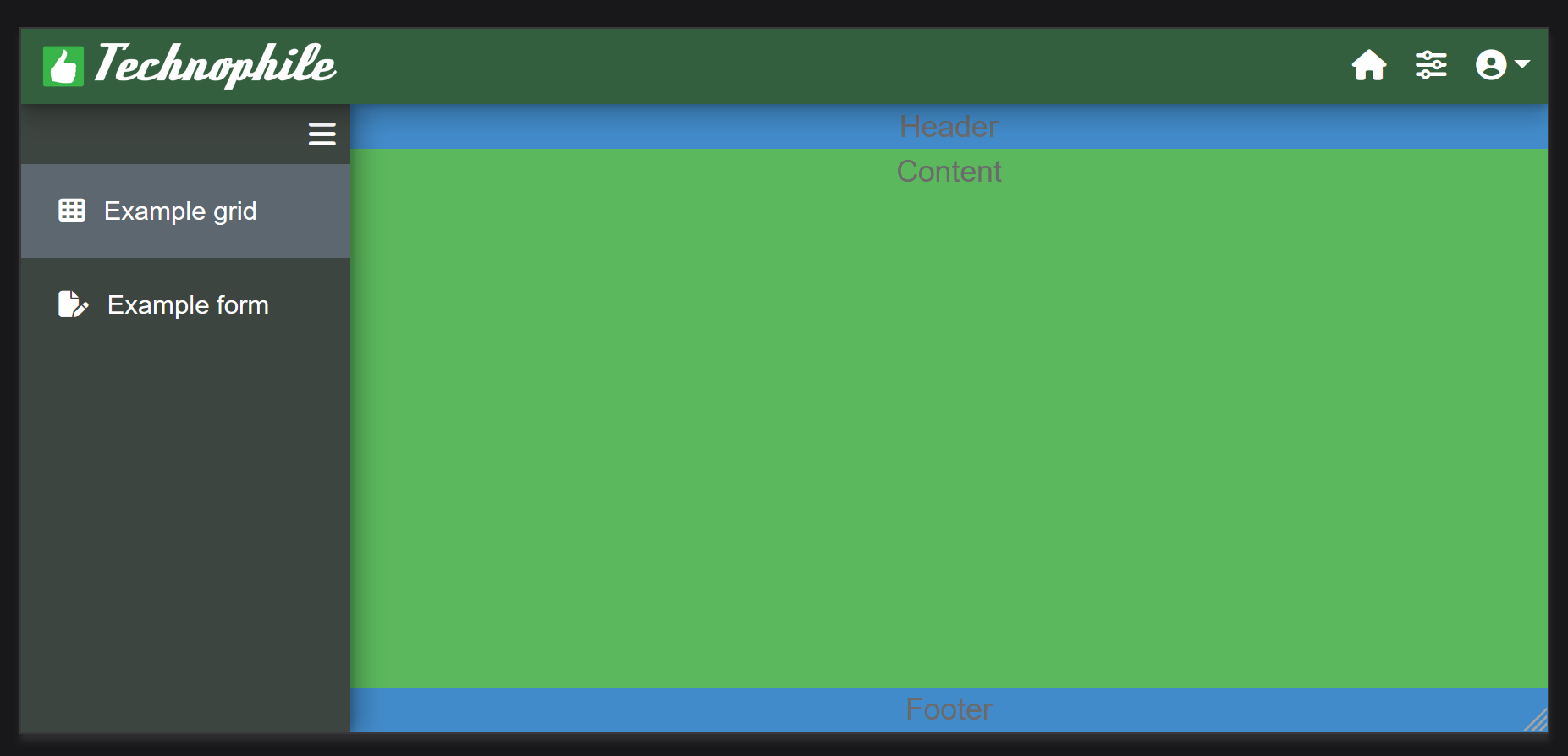
For years, I have been looking for the solution on how to make the sidenav play nice in a fully responsive solution so that it would fill the whole screen, along with the included form. I have not found anywhere a working model or a definitive answer on how to do this.
A few days ago, I’ve had the ‘eureka!’ moment so I’ll try to share what I found out.
Turns out it was pretty simple:
In the solution CSS:
Mandatory for full height forms in sidenav, this modifies a built-in class so no need to add anywhere but the css :
.svy-extra-sidenav {
height: 100%;
}
Add this class at the form level (as a styleClass property) for full height form inside sidenav :
.svy-form-fullheight {
height: 100%;
}
…and of course, setting the sidenav responsiveHeight property to 0.